SEE’S CANDIES REBRANDING
Packaging Design / Brand Identity / Graphic Design
Individual project / 14 weeks
Summer 2018
*Notice: This is solely a student work. The project is neither associated with See's Candy Shops, Inc. nor the brand “See’s Candies”.
Founded in 1921, See's Candies has been around for almost a century, yet the current brand design is outdated and does not fulfill what today's customers desire. While trying to present itself as a classic brand, See's Candies is disconnected from the modern world.
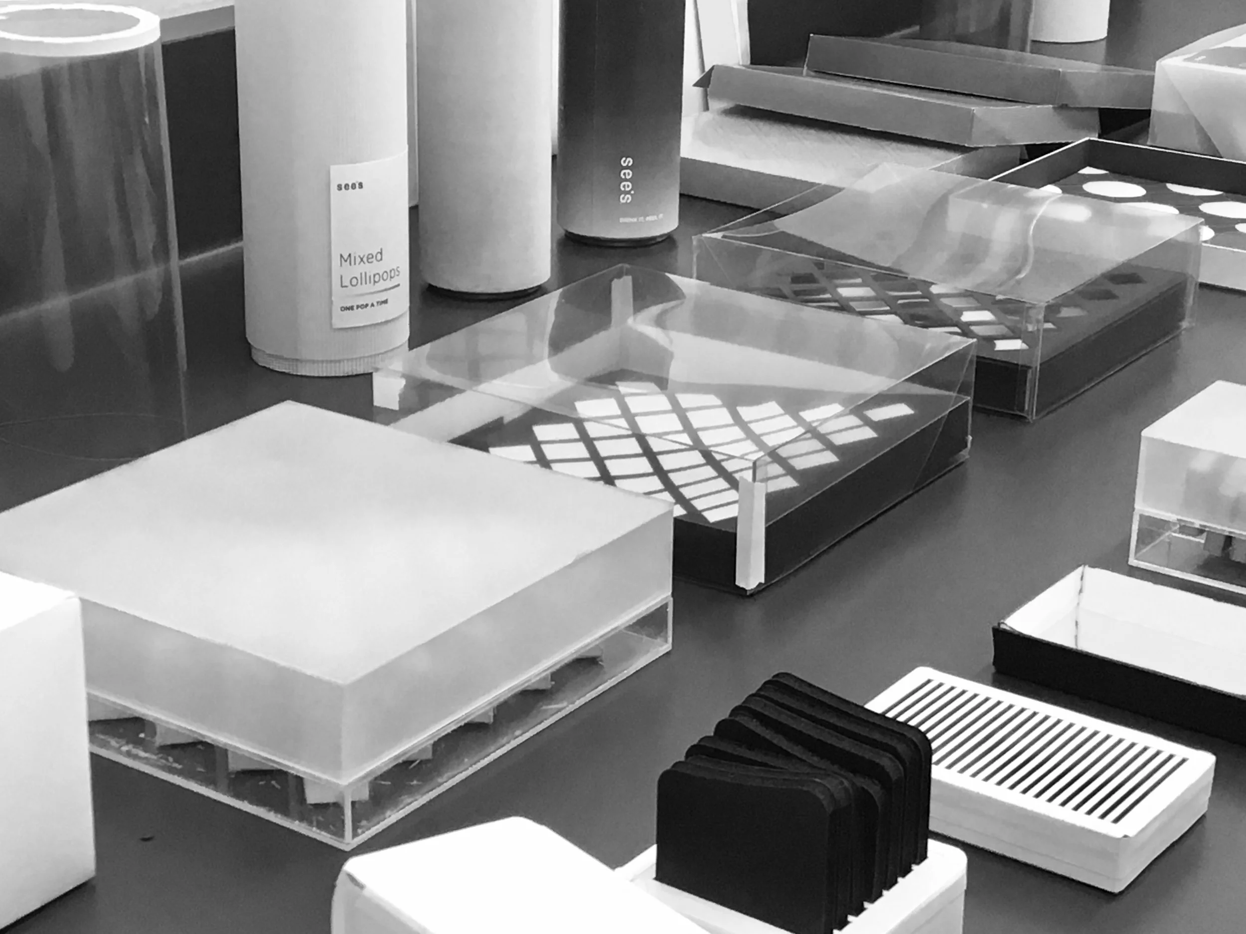
PACKAGING DESIGN
The concept was conceived to bring the classic American candy brand into the modern world. Using modern architecture as inspiration, I created a holistic tasting experience, from outside to inside. The new See's aim to take candies to the next level. By combining exquisite craft and technological precision, See's aim to bring customers delightful yet rewarding experiences to enjoy at every occasion.


Exquisite / Monumental / Technological / Delightful / Rewarding / Rhythmic

BRAND IDENTITY
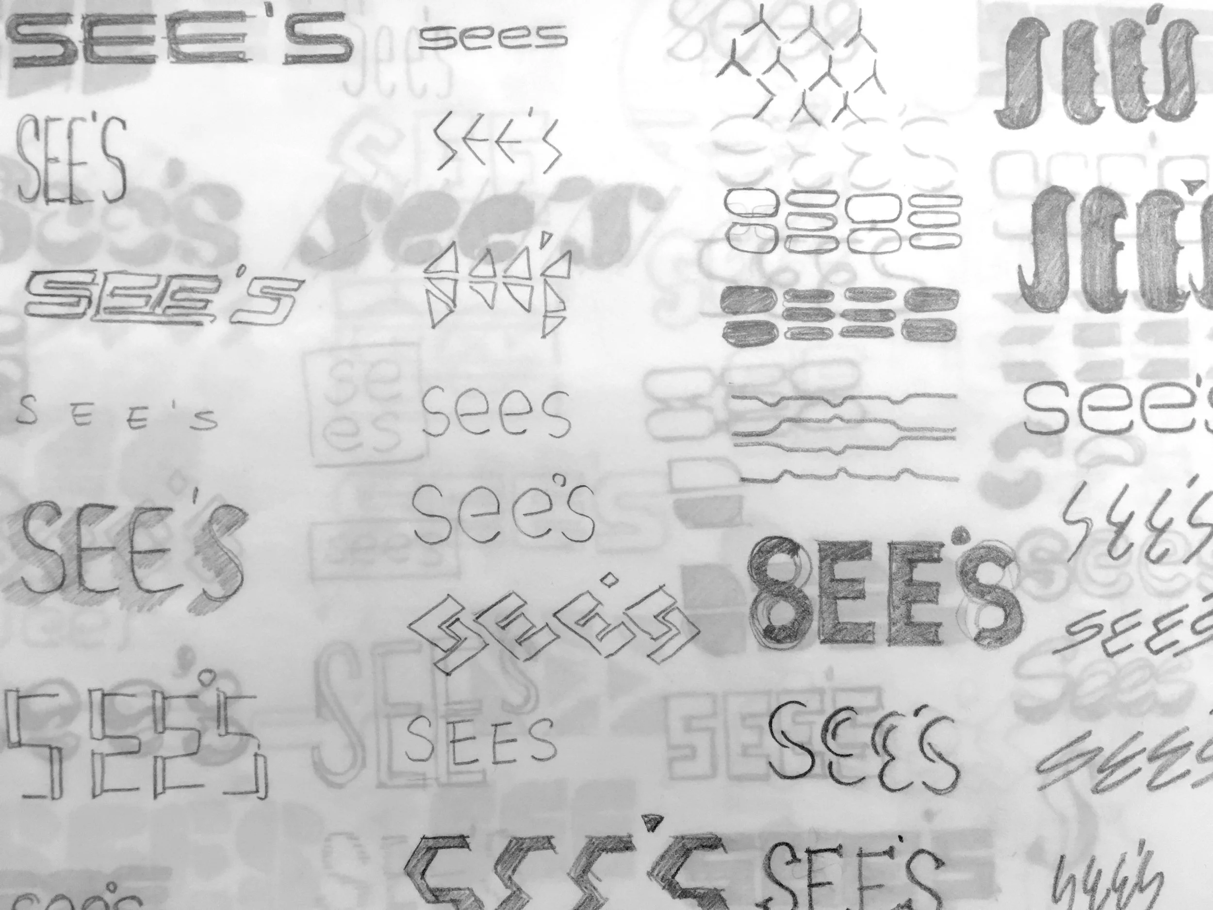
The new logo illustrates the new spirit of See’s Candies. Simplified as See’s, it allows consumers to build connections between See’s and candies. The apostrophe was changed to a dot so it does not break the rhythm. The four letters create a monumental feeling without losing the playfulness of candies by keeping them lowercase.
Logotype Lockup

Color Logotype